On August 11, 2026, the New York Fed released its Q2 Household Debt and Credit Report, and within hours a single figure had detached itself from the doc...
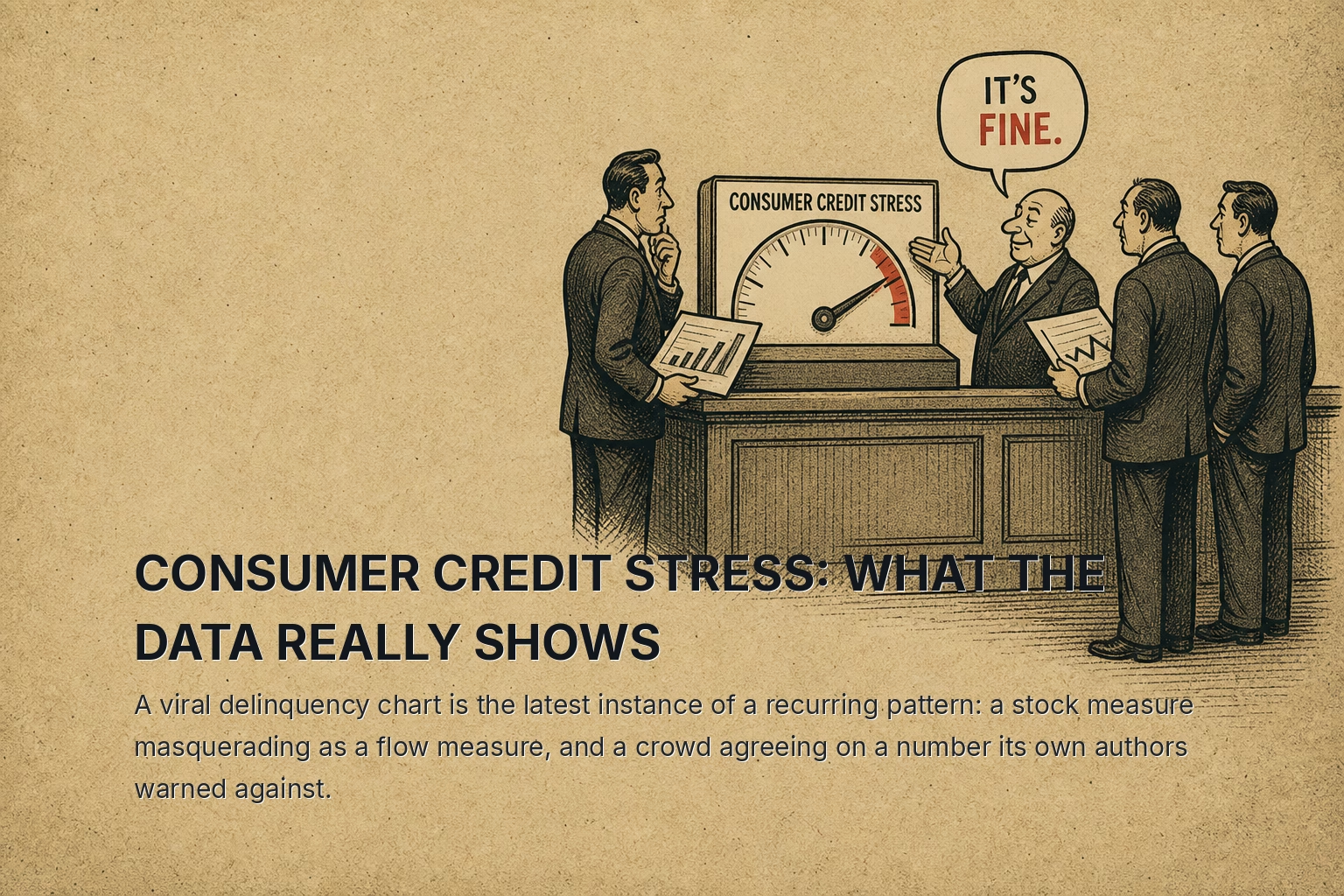
On August 11, 2026, the New York Fed released its Q2 Household Debt and Credit Report, and within hours a single figure had detached itself from the document and begun circulating on its own. The claim was clean and frightening: roughly 13% of credit card balances were 90 days or more past due, the worst reading since 2008. The number was real. It came straight from the Fed's own tables. And the economists who compiled it published a companion note the same day explaining, in careful and slightly weary prose, why it did not mean what the screenshots said it meant.
That gap between a headline number and its true meaning is not a novelty of 2026. It is a structural pattern, one that recurs whenever a measurement that counts an accumulated stock gets read as though it were measuring a current flow. The instruments change. The mechanism does not.
The Anatomy Of The Misread
Start with the ledger, because the ledger is undramatic. Total household debt actually fell by $13 billion on the quarter, a change of roughly 0.1%, leaving the total at $18.8 trillion. Credit card balances rose $21 billion to $1.26 trillion, up about 1.7%. Nothing in those aggregates resembles a crisis unfolding.
Then comes the figure that gets screenshotted. The share of card balances 90 days or more past due had climbed from 7.6% in late 2022 to 12.8% by the middle of 2026. That trajectory looks like a household sector coming apart, and read in isolation it is easy to see why it spread.
The Fed's economists drew a distinction that the viral version stripped away entirely. A stock measure counts every delinquent dollar still sitting on a credit report, including old charged-off debts that lenders keep reporting for years after the account has gone bad. A flow measure counts how much debt newly goes delinquent each quarter. The stock is the reservoir; the flow is the current. If the outflow at the bottom slows because lenders hold stale balances on the books longer, the reservoir rises even when nothing new is arriving.
The flow figure, the honest read on how households are behaving right now, moved from 6.93% to 6.97% year over year. That is not acceleration. That is measurement noise dressed up as a trend.
The mechanism behind the divergence is specific and worth stating precisely rather than gesturing at. From 2004 through 2012, only about 40% of charged-off balances were still being reported to the bureaus a year after the charge-off. By 2024, that share had doubled to roughly 80%. The stock rose because the accounting of dead debt changed, not because more debt was dying. Strip the stale balances out and the stock delinquency rate falls back into line with the flow.
The authors were explicit. "When the question is 'how are households doing right now?' the flow delinquency rates provide a more accurate view of current consumer repayment behavior," wrote Lee, Mangrum, Scally, Sinha and van der Klaauw. "By those measures, the pace of credit card delinquency is elevated but has been largely stable since 2024."
The people who built the chart were quietly warning the crowd not to trust the version of it that went viral. That is the whole episode in a sentence. And it belongs to a family of episodes.
The Same Error, Worn Before
Consider the Case-Shiller home price index during the housing recovery. In the years after 2012, headline national price levels climbed back toward and then past their 2006 peaks, and a recurring commentary took the aggregate as evidence that the pre-crisis bubble had simply reinflated. What the aggregate concealed was composition. The index was a stock-like snapshot of a housing market whose transaction mix, mortgage credit standards, and geographic concentration had shifted underneath it. Distressed sales that had dominated 2009 and 2010 had drained out of the sample. The number that looked like a return to 2006 was measuring a different market wearing the same units. Reading the level without reading the flow of what was actually transacting produced a confident conclusion that the composition data contradicted.
The pattern is older than that. In the early 1990s, as the savings and loan cleanup wound down, aggregate measures of nonperforming assets in the banking system stayed stubbornly elevated for quarters after new problem loans had stopped forming. The elevated level reflected the Resolution Trust Corporation's slow work of carrying and disposing of assets that had already gone bad. A stock of acknowledged losses sat on the books while the flow of fresh deterioration had already turned. An observer watching the level would have concluded the crisis was ongoing; an observer watching the formation rate would have seen it had ended.
In each instance the same three conditions held. A widely watched aggregate accumulated the past rather than measuring the present. A change in accounting, reporting, or composition inflated the accumulation independent of any change in current behavior. And a crowd, reaching for a clean number, read the reservoir as though it were the current.
Where The Real Stress Actually Sits
Dismissing the meme is not the same as declaring the consumer fine. This is the part the viral chart and its debunking both tend to skip, because the honest picture is harder to screenshot.
The stress is real. It is simply not spread evenly, and the aggregate delinquency figure, whether stock or flow, averages away the thing that matters. Beneath the surface the household sector is splitting into two populations: an upper half spending comfortably against appreciated assets, and a lower half running on fumes.
The savings data gives the clearest read into that divergence. In July 2026 the personal saving rate fell to 3.0% of disposable income. A rate that low, sustained, does not describe a household sector with a cushion; it describes one where a meaningful share of families are spending nearly everything that arrives. The macro backdrop tightens the vise: the 10-year Treasury yield sat at 5.17% and the 2-year at 4.81% as of late September, with the 2s10s spread modestly positive at 0.36%. For the bottom-half household carrying revolving balances, the cost of that debt is set at the short end and it is not low. CPI at 334.1 in August confirms that the prices those households cannot escape have not receded.
The genuine signal, in other words, is a distributional one, and distributional stress is precisely what a single aggregate line is built to hide. The same averaging that let the stock delinquency number look like a crisis also lets a stabilizing flow number look like an all-clear. Both readings are wrong for the same structural reason: an aggregate is not designed to show you a population pulling apart at the seams.
What The Pattern Teaches
The lesson is not that the New York Fed's data is untrustworthy. The opposite: the data was fine, the companion note was candid, and the answer was published the same morning the question went viral. The lesson concerns the reader, not the source.
A stock measure and a flow measure answer different questions, and the failure mode is to take the one that is easier to find and treat it as the answer to the question you actually care about. When a widely shared number accumulates the past, when a change in accounting or composition inflates that accumulation, and when a crowd converges on the level because the level is a clean single figure, the same misread recurs. It recurred in the housing recovery aggregates, in the post-thrift-crisis loan books, and it recurred again this August with a 12.8% that meant 6.97%.
The correction, though, carries its own trap. Having debunked the scary number, it is tempting to file the consumer under "fine" and move on. The distributional data forbids that. A 3.0% saving rate against a 5%-plus short rate is a real signal about a real segment of households, and it will not appear in the aggregate that everyone was arguing about. When the crowd agrees on a chart, the useful information has usually already moved somewhere the chart does not look.